Beyond the thermometer: A guide to understanding heat in urban areas

Updated: Sep 7
Every summer, heat enters the news through a number: a city records 40°C, a temperature record is broken, or a heatwave warning is issued. These numbers are important, but they tell only one part of the story.
A city can record an air temperature of 35°C while the surface of a nearby road is considerably hotter. Two people exposed to the same air temperature can experience very different levels of heat stress depending on whether they are standing in the sun or under a tree, working outdoors or sitting indoors, or living in a humid coastal environment or a drier inland one. This is because heat is not a one-dimensional phenomenon that can be captured by a single number. It varies across space and time and is shaped by the interaction of atmospheric conditions, urban form, land cover, vegetation, water, solar radiation, wind, humidity and human physiology.
Understanding these differences is increasingly important as cities around the world become warmer. It helps us move beyond simply asking "How hot is it?" to asking what kind of heat we are measuring, where it is occurring, how it is experienced, and what it means for people and urban environments. This blog outlines and discusses the different ways heat can be measured, what each method captures, and why the choice of metric matters for how we understand and report on heat.
The starting point
The most familiar measure of heat is air temperature. It tells us how warm the atmosphere is at a particular location and time and is central to weather forecasting, climate monitoring and heatwave warnings. Air temperature is measured under standardised conditions so that measurements can be compared across locations and over long periods. This makes it particularly valuable for understanding climate trends and extreme events. It can help answer questions such as: Are temperatures increasing over time? Are extreme temperatures becoming more frequent? Is a particular period unusually hot for this location? How does today's temperature compare with historical conditions?
Long-term air-temperature records are therefore fundamental to understanding a changing climate. But air temperature has a limitation: it describes the atmosphere, not the complete thermal environment of a city. A weather station represents conditions at a particular location. It cannot capture every variation occurring across streets, buildings and neighbourhoods. To understand those spatial differences, we need to look at the surfaces that make up the city.
Heat is not the same everywhere, even within the same city
A temperature recorded at a meteorological station tells us something about the atmospheric conditions at that location. It does not tell us whether a densely built neighbourhood, a tree-covered street, a lake edge and a large open construction site are experiencing the same thermal conditions. The difference can emerge over a few hundred metres (Fig.1). A shaded street can feel very different from an exposed road. A neighbourhood with extensive tree cover can have different surface temperatures from one dominated by concrete and asphalt. A low-lying area with water and vegetation can behave differently from a densely built-up area with little permeable ground. These dynamics highlight how different heat metrics become useful, allowing us to look at the same city at different scales and through different dimensions of heat.
Imagine looking at a satellite image of Bengaluru on a hot afternoon. Instead of seeing roads, buildings and parks simply as land uses, a thermal satellite can show how hot those surfaces are (Fig.2). This is Land Surface Temperature (LST). LST is derived from thermal infrared measurements from satellites and represents the temperature of the surfaces such as roofs, roads, bare soil, vegetation and water, not the temperature of the air above it. A dark asphalt road can become much hotter than the air above it because it absorbs solar radiation. A tree canopy can remain considerably cooler because vegetation uses water and provides shade, and water bodies often appear as cooler areas in daytime thermal imagery.

LST therefore provides a powerful way of asking - where is heat accumulating within the city? As such, LST is particularly useful for examining intra-urban differences and understanding the relationship between heat and land cover. It is important to note that a surface temperature of 50°C does not mean that the air temperature is 50°C, nor does it mean that a person standing nearby is experiencing 50°C air. The LST reveals spatial patterns of surface temperature, but additional information is needed to understand its causes and meanings.

As satellite observations are snapshots in time, the first question to ask is when the image was captured. A daytime image captures a different thermal pattern from a night-time image. Similarly, an image captured during the dry season cannot automatically be compared with one from a wetter period. Other important questions include: What is the spatial resolution? What is the unit? What area does each pixel represent?
Don't just ask how hot, ask how unusual
Another important distinction that matters when interpreting heat data is absolute temperature versus anomaly. If a satellite records a LST of 45°C in two locations, that value indicates that both locations had a temperature of 45 °C at the time of observation. However, if the first location typically records around 44°C and the second around 38°C, the same absolute temperature therefore represents very different departures from normal conditions. Absolute temperature tells us how hot; an anomaly tells us how unusual and, therefore, it can be particularly useful for understanding change.
As such, LST anomaly maps (Fig.3) show how surface temperatures differ from the long-term average. Positive anomalies indicate warmer-than-average conditions, while negative anomalies indicate cooler-than-average conditions. These anomalies vary from year to year. In general, areas that change from natural land cover to impervious or developed surfaces (for example, vegetation replaced by concrete) tend to shift from negative to positive LST anomalies.
The same principle applies to air temperature: a temperature that is routine in one city can be exceptional in another. For this reason, heatwave criteria often consider both absolute temperature thresholds and departures from the local climatological normal.

The human experience
Environmental measurements can tell us about the conditions around us, but they cannot fully capture how those conditions are experienced by people. Human thermal exposure is shaped by factors beyond air temperature. Consider two people outdoors at the same time. One is standing under a tree; the other is in direct sunlight. One is feeling a breeze, while the other is surrounded by buildings that restrict airflow. One is near a large concrete surface that has absorbed solar energy, and the other is beside vegetation. They may be experiencing the same air temperature, but their thermal environments are distinct, and that’s where thermal comfort and heat-stress metrics become more useful.
The Universal Thermal Climate Index (UTCI) estimates outdoor thermal stress by considering environmental conditions, including air temperature, humidity, wind and radiant heat. These factors are particularly valuable when examining streets, public spaces, neighbourhood design and the role of shade, vegetation, building form and airflow.
Humidity introduces an additional dimension. The human body cools itself partly through sweating. For sweat to provide cooling, it needs to evaporate. When humidity is high, evaporation becomes more difficult, limiting the body's ability to lose heat. The Heat Index combines air temperature and humidity to estimate how hot conditions may feel to the human body. Consequently, the same air temperature can have very different implications under different humidity conditions. But humidity is only one part of the physiological story. Solar radiation, wind, clothing, physical activity and the surrounding thermal environment also shape how much heat the body gains or dissipates. This is why no single "feels like" temperature can fully represent every aspect of human heat exposure.

When heat becomes a question of work
Heat exposure also depends on what people are doing and the conditions of the spaces they occupy. Someone sitting quietly indoors may face less heat strain than someone performing strenuous physical work outdoors, but indoor spaces can also become dangerously hot, particularly when there is inadequate ventilation, limited airflow, poor building design or no access to cooling. Physical activity generates additional metabolic heat, while clothing, radiant heat, humidity and limited airflow can further intensify heat strain.
This is where Wet Bulb Globe Temperature (WBGT) is particularly useful. It incorporates air temperature, humidity, radiant heat and wind to assess heat stress, particularly during physical activity. It is therefore relevant to occupational exposure, sports and other forms of physical exertion. However, for indoor environments, WBGT is not always the most appropriate measure, particularly where radiant heat and airflow conditions differ from outdoor settings. Indoor heat exposure may also require looking at air temperature, humidity, ventilation, building characteristics and access to cooling. A citywide air temperature may tell us that conditions are hot, but understanding heat exposure requires considering where people are, what they are doing, and what conditions they are experiencing in those spaces.
Beyond heatwave declarations
Official heatwave declarations often rely primarily on maximum air temperature and its departure from normal. However, other dimensions of heat can reach dangerous levels without triggering an official heatwave declaration. Land surface temperatures may be exceptionally high, humidity may increase physiological heat stress, or temperatures may remain elevated for several days without meeting the criteria for a formal warning. For vulnerable populations, outdoor workers, and those without air conditioning, this creates a critical blind spot: the health risks of prolonged heat exposure remain severe, yet without a formal declaration, emergency public health interventions, cooling centres, and community support systems may fail to activate.
This is where different heat metrics become indispensable - alerting us to localized threats even when an official heatwave warning has not been issued. Heat warning systems are developing as scientific understanding, data availability and public-health approaches evolve. Increasingly, warning systems are incorporating factors such as humidity, duration, overnight temperatures, recent climatic conditions, acclimatisation and expected health impacts. Countries are at different stages of incorporating additional dimensions of heat risk:
Country/region | Approach to heatwave/heat-health warnings | What this adds |
India – IMD | Primarily maximum air temperature and departure from normal | Accounts for local climatology through temperature thresholds and departures from normal; impact information is increasingly incorporated into advisories. |
Australia – Bureau of Meteorology | Excess Heat Factor (EHF) | Considers how unusual a three-day period is for the location and how hot the preceding period has been, incorporating an element of acclimatisation. |
United States – National Weather Service | Heat Index and newer risk products such as HeatRisk | Considers factors including temperature, humidity, duration, overnight conditions and local climatology in assessing heat risk. |
England – UKHSA and Met Office | Impact-based Heat-Health Alerts | Links forecast conditions to the likelihood and severity of expected health impacts. |
A heatwave declaration is an important public warning, but it should not become the only lens through which heat exposure is understood. Heat risk can exist before, beyond, or outside an official heatwave classification. Understanding that risk requires looking at the different dimensions of heat, where they occur, how long they persist, and who is exposed.
What should a heat story actually ask?
Heat reporting often begins with a number because numbers are easy to communicate. But a single number rarely captures the full phenomenon. Each metric provides a different window into heat.
If your story is about... | A useful metric/data source is... |
Whether the climate is warming | Long-term air temperature records |
Whether a heat event is unusual | Air temperature and temperature anomalies |
Whether a heatwave threshold has been crossed | Official meteorological data and heatwave criteria |
Which parts of a city have hotter surfaces | LST |
How urbanisation is changing heat patterns | LST + land-use/land-cover data |
Why humid heat feels worse | Heat Index / humidity |
How urban design affects outdoor thermal stress | UTCI |
Risks to outdoor workers | WBGT and occupational exposure data |
Whether people get relief at night | Minimum/night-time air temperature |
Who is most vulnerable | Heat data combined with demographic, health, housing and occupational data |
A useful heat story does not need to include every available metric. Instead, the choice of evidence should follow the question being investigated. A reporter or researcher examining heat in a low-income settlement, for example, might begin with air-temperature records to establish the broader heat event, use LST to investigate spatial differences in surface temperatures, examine housing materials and ventilation to understand indoor conditions, and speak to residents and workers about how long they are exposed, what they experience, and what coping strategies are available.
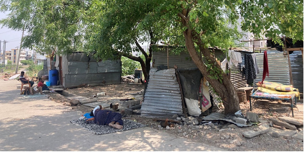
Good heat reporting moves beyond asking how hot it is to ask where the heat is, who is exposed, under what conditions, and with what consequences.



Comments